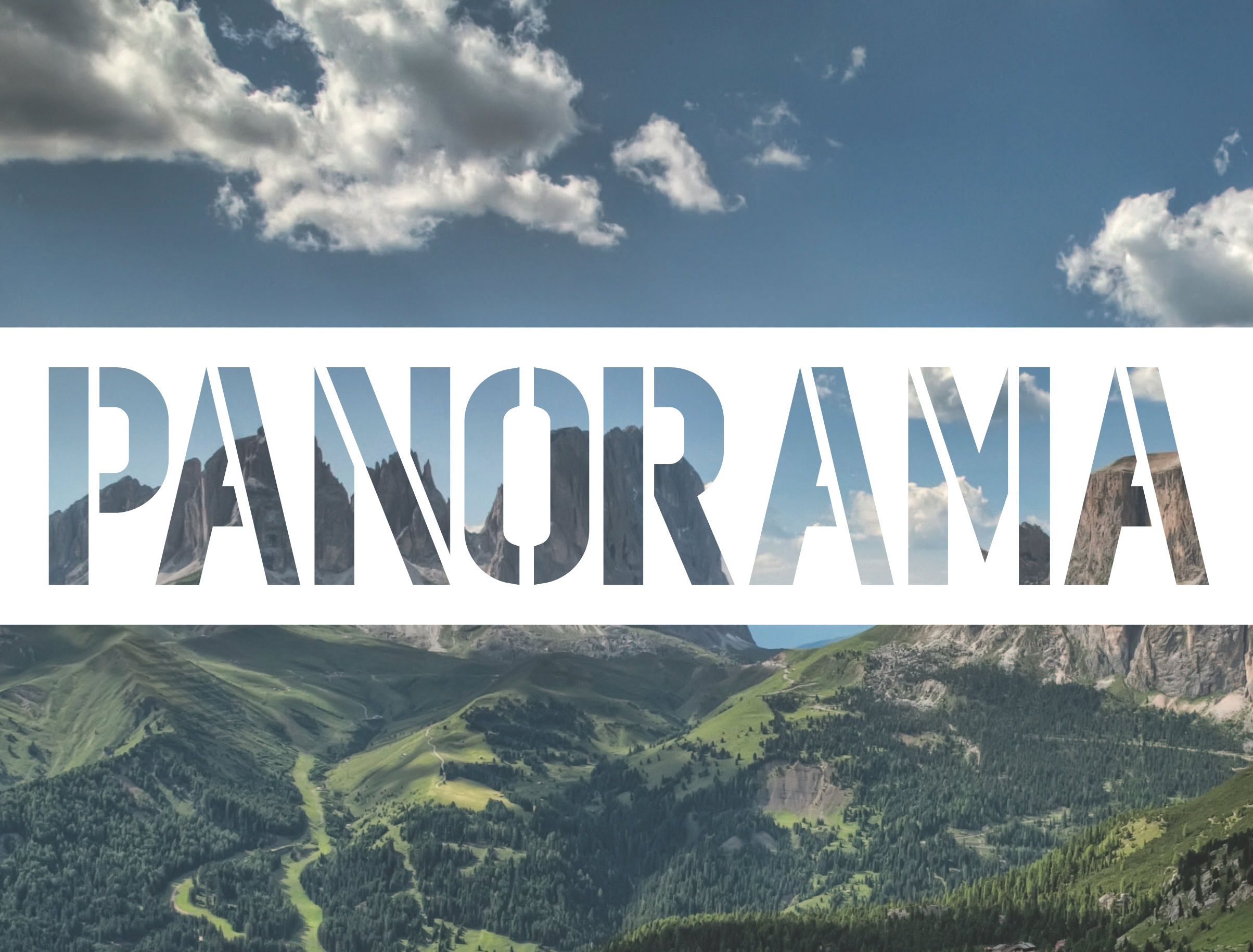


Panorama
Panorama is a new system of visual identity, information, orientation and signaling dedicated to cycle-pedestrian paths.
The topics related to the sustainable development of the territory have been at the center of several studies and debates in recent years. There is no doubt that the economic development of a community in the short and long term must be in the respect of the environment, in order to meet today’s needs without compromising future expectations. A sustainable model is based on a slow and controlled development of the territory, so that it is grasped by the community without negative repercussions and it protects the natural and cultural heritage. The right approach aimed at achieving the sustainable development of a territory is the so-called “sustainable tourism”, a development model designed to improve the quality of life of the host community, to provide high quality experience for visitors, to secure profit without placing it before the quality of the environment.
In this sense, the realization of cycle-pedestrian paths for the practice of cycle tourism is an opportunity not to be underestimated for a controlled and intelligent development of the territory. Currently cycle tourism is a widespread practice in north-central Europe, and although cycle-touristic practice in Italy is suffering a serious delay, also in our country we now witness to the ecological trend of tourism for secondary roads, for the country roads, for the mountain trails, that gradually introduces to the possibility of long cycling trips and to the cycle tourism. This target certainly represents a potential economic resource for rural areas, far from urban centers and large transport routes, rich in natural beauty, green oasis and natural parks. In many regions of Italy, bicycling has become a recreational activity, attracting a large number of practitioners, who make this means of transport and exercise a way to enjoy the landscape.
The development of a cycle-pedestrian network is therefore a virtuous way that triggers landscape valorisation processes, thanks to requalification of existing routes and creation of new itineraries. In this context of development lies the creation of a new system of information, orientation and signaling specifically dedicated to cycle-pedestrian paths. It is important to emphasize how our concept of a new system of information, orientation and signaling can not, however, ignore the knowledge and understanding of the site and must therefore interact with a territorial marketing, tourism and commercial promotion project in the territory. We believe that sustainable environmental development, enhancement of historic and landscaping heritage and the promotion of local identity relate to a constant process, a continuous sequence of phases where integrated public participation is necessary and indispensable. An information, orientation and signaling system must be therefore integrated with guides, maps, computer and digital systems, allowing you to limit the information to only the most important, thus reducing the size of the sign to adopting a simple and minimal shape for all information elements. For situations not covered by the Highway Code rules, for example along paths, forest tracks and bike lanes, we have designed a specific information, orientation and signaling system for pedestrians and cyclists. On the experience of European countries, oriented towards specific signage for smaller and more diversified cycle-pedestrian paths than traditional road signs, except for vertical signage that warns the driver of the presence of a cycle-pedestrian or an intersection, the other elements of communication for the pedestrian and the cyclist contain, in addition to orientation indications, additional and subsidiary information about the itinerary, even with small-sized fonts. Panorama is a project of visual identity, information, orientation and signaling. It is a proposal that presupposes the simplicity, the clarity and the readiness of reading information. The design makes the use of these elements particularly suitable in environmental valuable context, protecting the preservation and conservation of landscape values. The system is structured around a set of coordinated and recognizable elements that can be used individually and in various combinations, as needed, providing a kit for the development and definition of a territorial marketing, tourist and commercial promotion project. The design is contemporary and is characterized by both the quality of the supports, the graphics and the intrinsic pleasure of experimentation.
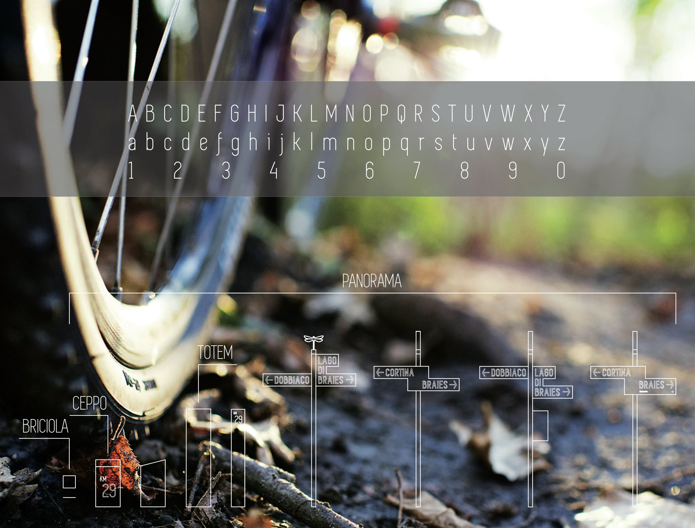
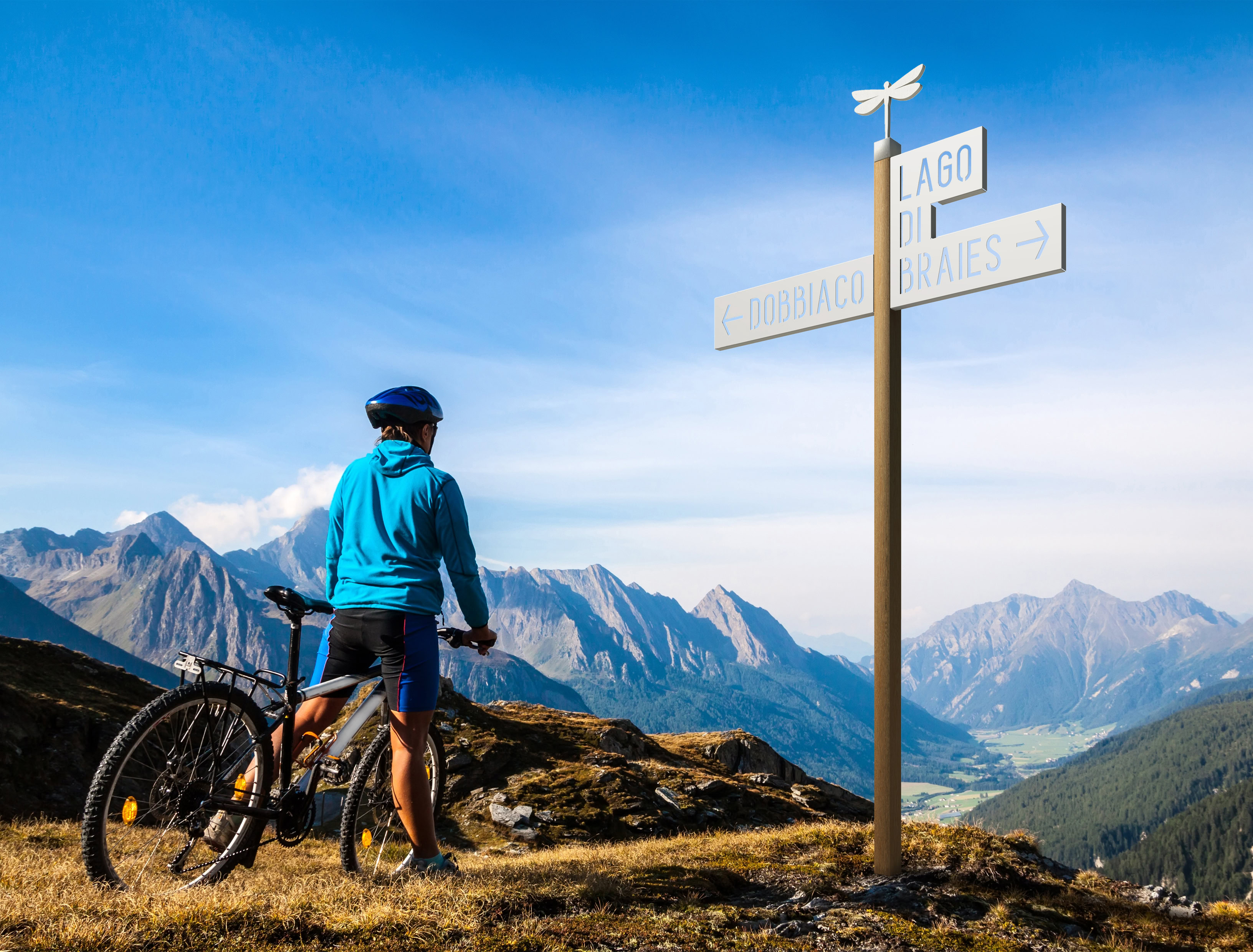
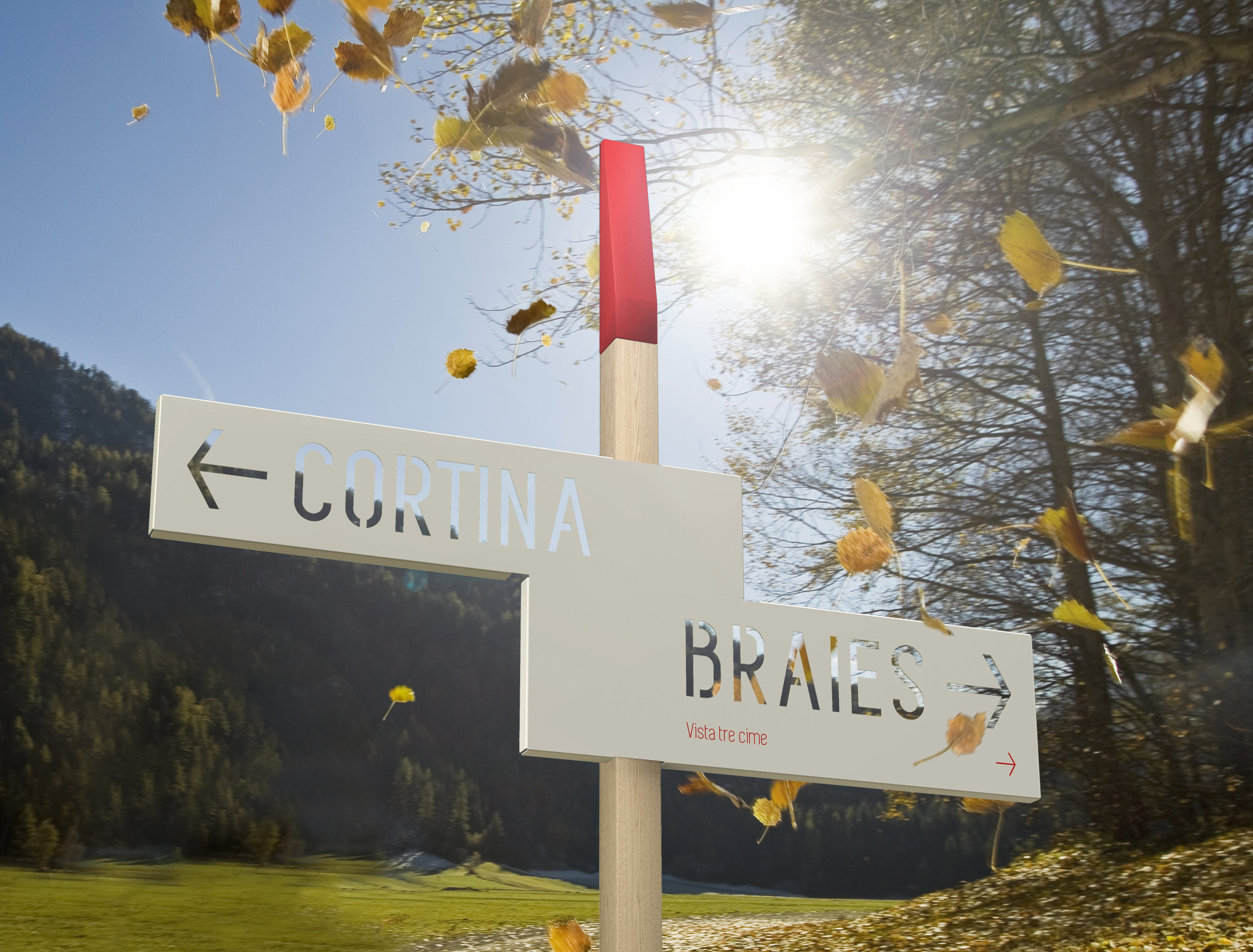
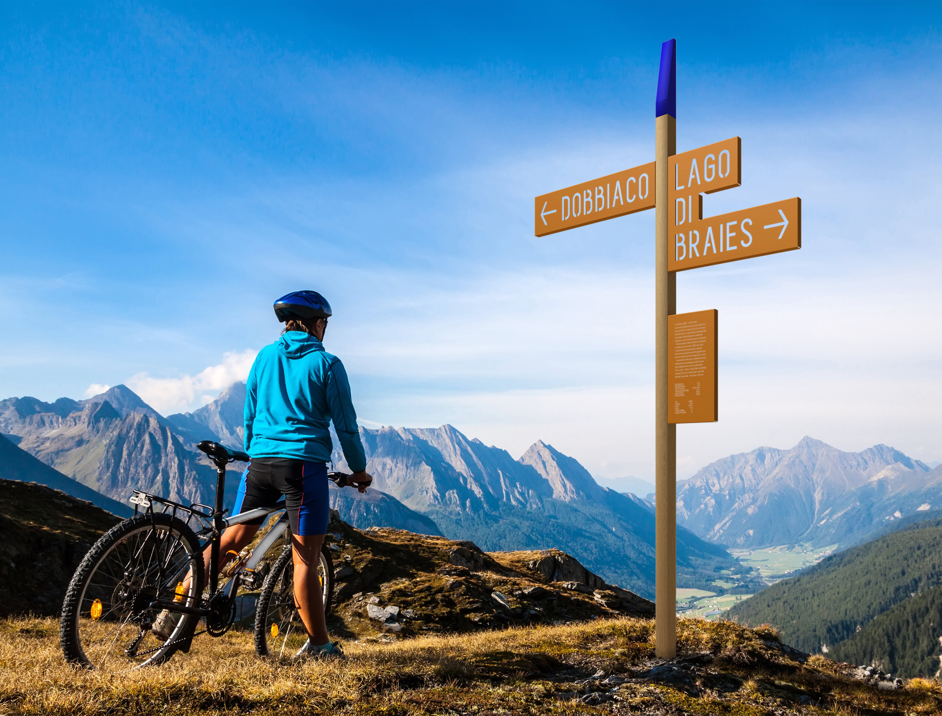
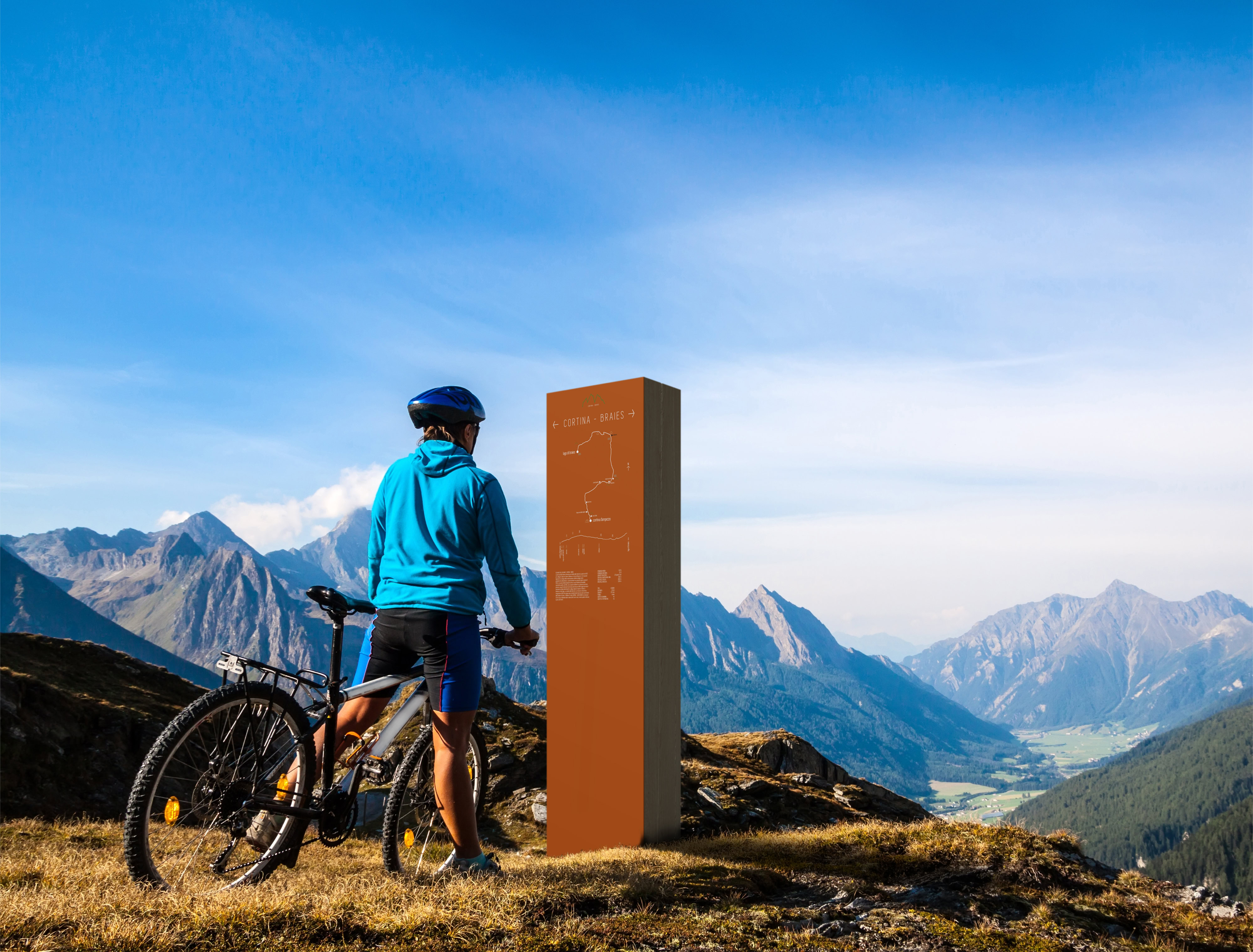
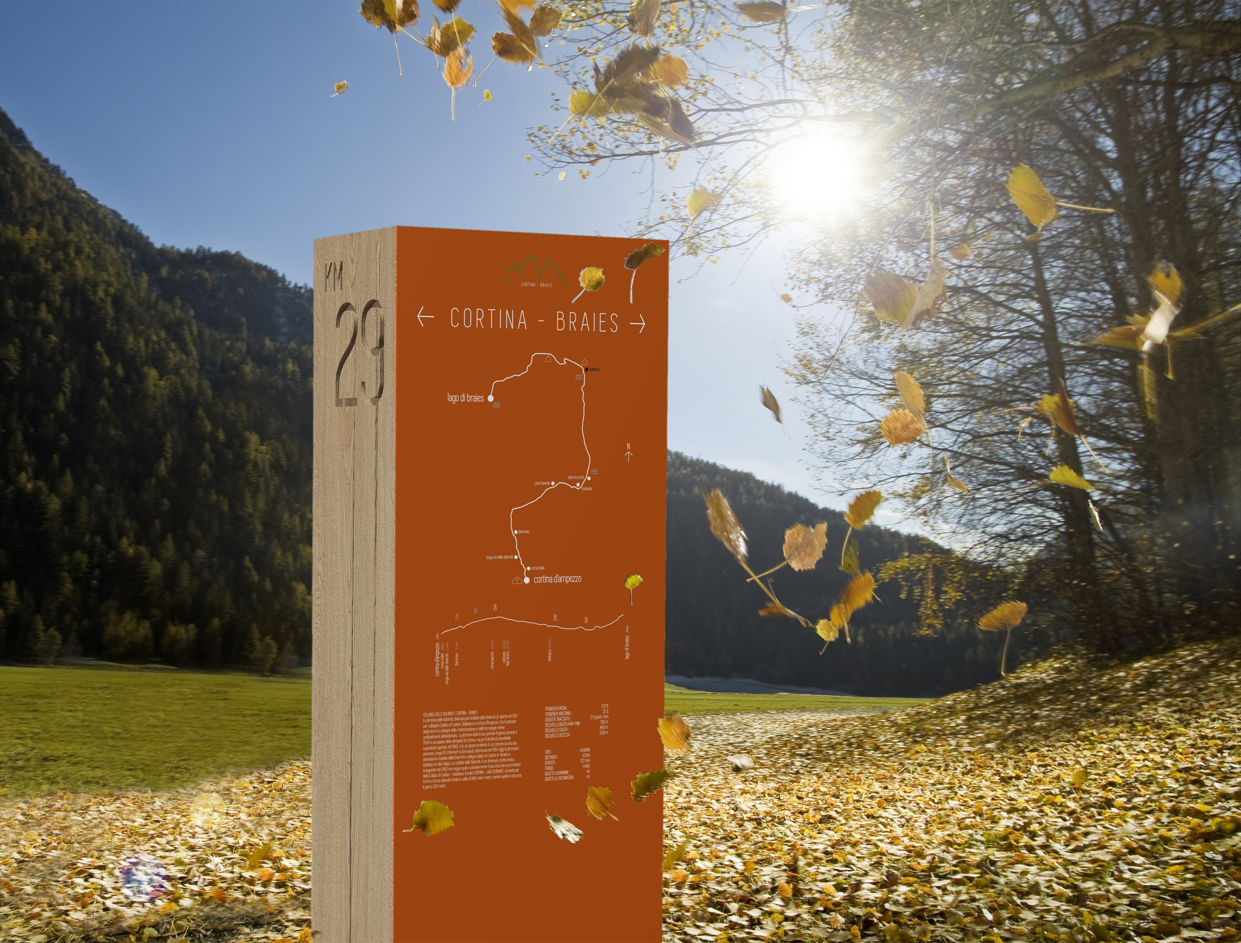
Graphic processing is based on the use of text and font in horizontal compositions on a carved aluminum support, bent and dimensioned according to the progression and flow of text, providing flexibility and variation in its application while simultaneously reducing its size. The support pole is made of wood and the terminal is customizable in shape and color. An identifying graphic and typographical structure based on the repetition of a number of recurring elements that contribute to creating visual cohesion. A composition with overlapping and transparency play, whose goal is to provide a recognizable visual language and able to adapting to the various communication needs. Product characterization is such that the use of a single element gives a unitary perception of the entire coordinated communication system. The proposed font is “Simplifica”, considered a versatile, readable and modern font. The system is completed with three other elements defined as “Totem”, “Ceppo” and “Briciola” to support information along the cycle-pedestrian paths in naturalistic contexts, with the aim of providing adequate information, orientation and signaling without significantly interfere with the context described. The design of these elements allows us to put them in the landscape in a “silent” way, with respect for the identity of the places and dialogue with it. At the level of communication, aesthetics is a complementary value to that of information transmission: communication has an attraction in the aesthetic, the trace of the presence of a system, which makes it visible and recognizable, participates in its communication.
The aesthetic component is assumed as an added value for communication, as it avoids that the element camouflages itself in the multitude of other signs, falling into anonymity.
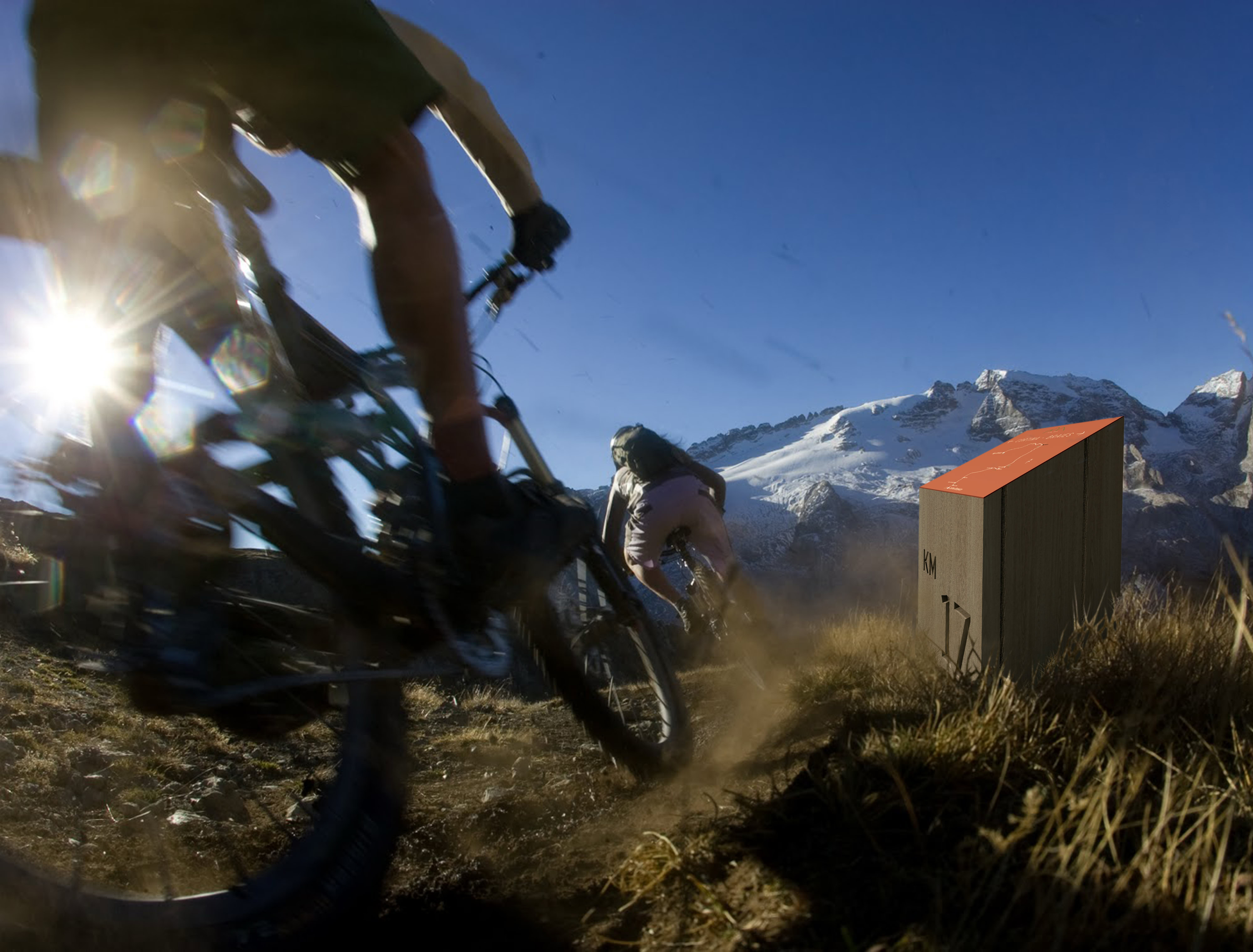
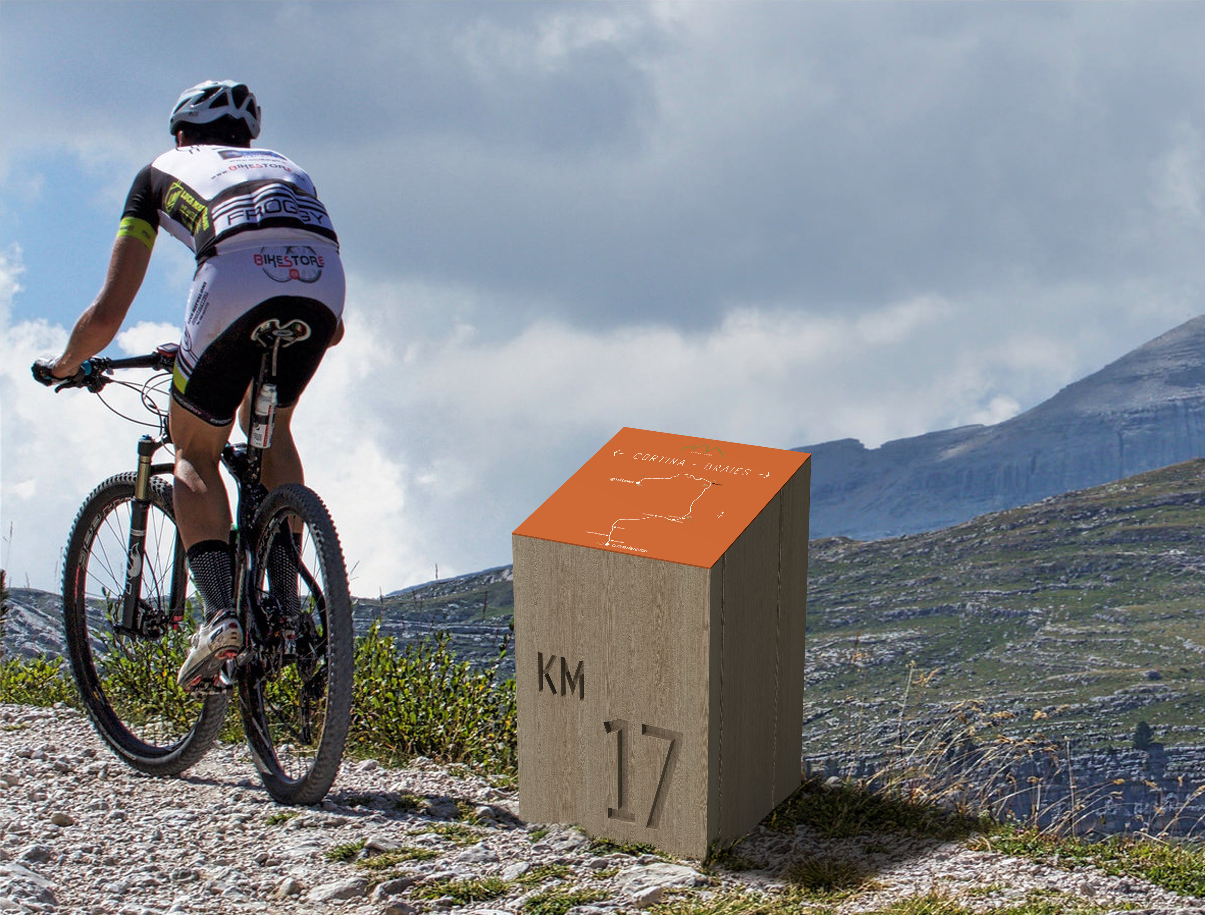
The “Totem” and the “Ceppo”, made of solid wood, are monolithic, coarse and rough in their geometric lines. One of the faces is highlighted for contrast with a different material and color. The information is arranged on this surface. The mileage of the route is engraved directly on the wood. Wood is a primordial material that brings us back to the earth. Its use as an ancient and archetypal natural material has been chosen to awaken the ancient memory of man. The choice of wood is also to propose a renewable material to infinity: regardless of how much you use it, it’s always possible to replace it and, more you use it, more it’s cultivated, with clear benefits for the environment. The “Totem” offers a large surface where you can design text and graphics with information, orientation and signaling functions. This surface is made of aluminum, with different possibilities for engraving, printing and digital image transfer. Placed in specific points, in addition to map, position, elevation profile of the path and travel times, it can provide historical, geographic, cultural, topographical information, etc. about the itinerary or about the specific site. Complementing the “Totem” and with similar geometric and material characteristics, the “Ceppo” is a wooden element to be placed on the edge of the path, used to map distances along the itinerary and to orient yourself to the territory shown on the map. The maps are multiplied and translated into thematic maps, tools that emphasize the many vocations of the territory crossed by a grid of paths: wine paths, sacred paths, park paths are just some of the infinite ways to read the territory and to transcribe points and connections on the map that help to define different spatial structures. The map is the ideal solution for organizing a pedestrian or bicycle itinerary, because it provides many details and information in a narrow space. The mapping system is coordinated, that is, starting from the master map, the thematic maps are extracted in the different scales and formats for different purposes. The information and graphic appearance will always be coherent, though correlated from time to time to the reading scale necessary and depending on its use.
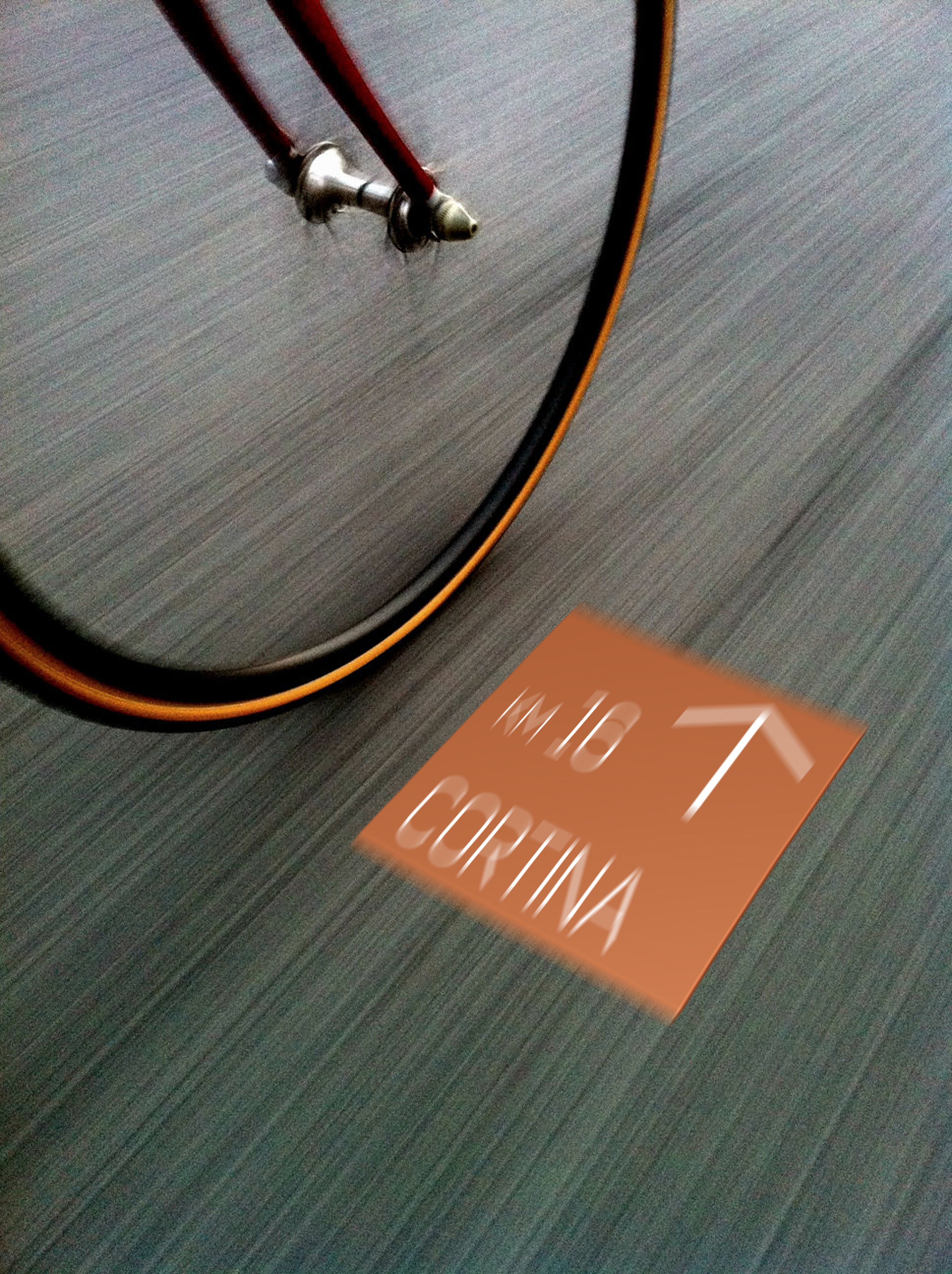
The approach of a pedestrian and a cyclist to the information system is very different from that of a motorist. For this reason, the design of a pedestrian and cyclist oriented system is a detail project, because it can be simpler and more immediate than road signage. Improving orientation, accessibility and use of information for pedestrians and cyclists generates a more inviting experience for everyone. The sign system dedicated exclusively to pedestrians and cyclists allows lower visual impact. From these considerations and from the design tension aimed at the synthesis and simplicity of things, comes “Briciola”, a floor element for signaling and orientation for pedestrian and cyclist, designed for all paved paths. Square-shaped, made of metal on a concrete block, can be easily inserted into existing pavements with no interference to the overall visuals. Inspired by the famous Grimm brothers’ tale, “Briciola” is a hymn to simplicity and joy!
At the CosmoBike Show in Verona Massimiliano Gamba and SI.SE SpA win the CosmoBike Tech Award 2016 with the Bellavista and Panorama systems.
Design
Massimiliano Gamba
2016
Client
SISE SpA


