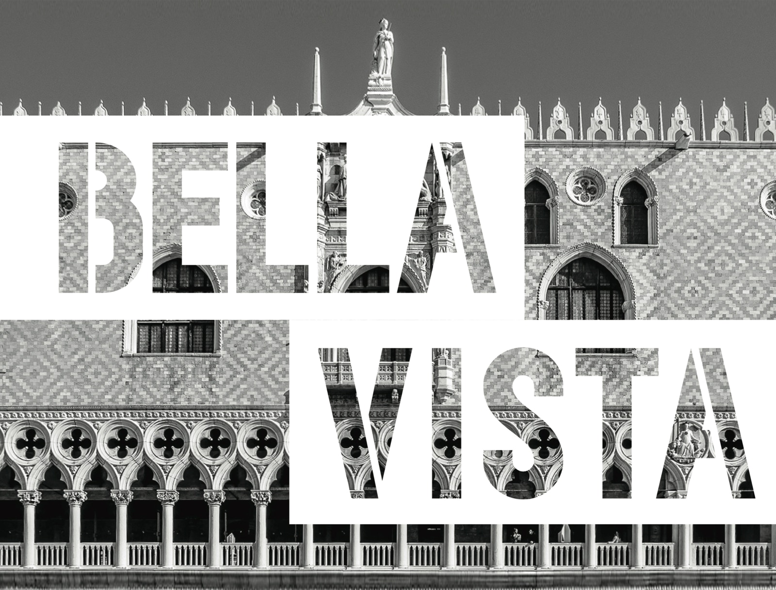


Bellavista
Bellavista is a new system of visual identity, information, orientation and signaling dedicated to the historic city.
The environment we live in is constantly changing. The historic city also transforms in changing the demands of citizens and the needs of contemporary life.
If this transformation into a wider city concept, detectable on the periphery, connecting arteries, new urban settlements, remains generally acceptable because the details are lost with respect to the size of the city and to a wider landscaping context, in the historic centers, where everything is close, the perception of the place and its quality manifests itself on a much smaller scale. In a historical center, consisting of narrow streets enclosed by houses, small squares, public green mainly outlined along historic tracks, the detail made of the façades of buildings, decorations, floorings, lighting, road signs plays a fundamental role in the perception of the site.
Thus, intervention modes change responding to instances in relation to the delicacy of an historicized context where often the degradation of the urban landscape and unsuitable and unexpected scenarios in relation to the historical and artistic characteristics of the place are produced. An old town is particularly important, belonging to a system of relationships between historical and cultural elements that connect historical important buildings, parks and gardens, public paths and streams, which form the connection between significant environmental situations. The vulnerability of the site is therefore very high and in this sense the small incongrous transformations and above all the summaries of these can play a significant role, which can gradually overcome the image and the historical characterization of the site. Inserting signage elements and their composition in urban scenery, as well as introducing inappropriate components and materials, if done indiscriminately, can be a major loss of local identity.
The type and quality of vertical and horizontal signage typically used in urban areas, together with its use often limitless and invasive, therefore leads to a re-reading of the information system, orientation and signaling dedicated to the historic city. Road signs are often placed with repetitions and excess, according to a logic that does not take into account the historical, architectural and artistic value of the places, buildings and valuable perspectives, typical of a historic center. Here the concentration of signposts near the road crossings dramatically interferers with important values such as road grid and perspective views, compromising the delicate balance of the urban scenography of a historicized center. That is why these elements take on an important functional and aesthetic value in relation to the historical and artistic context in which they are located, as well as the overall image that derives from it.
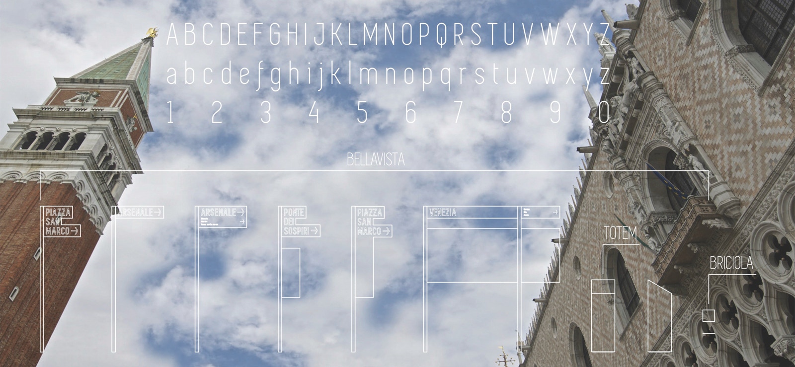
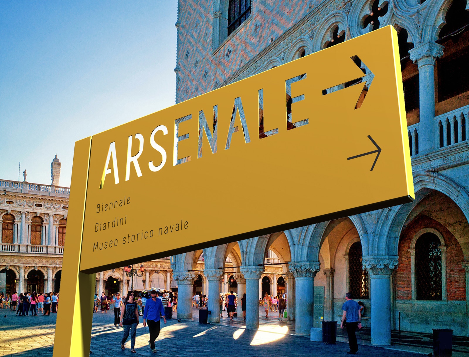
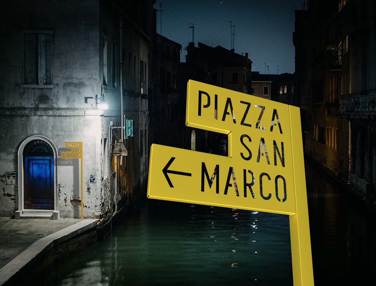
The conception of new information, orientation and signaling system dedicated to the historic city can not ignore the knowledge and understanding of the site and must interact with a territorial marketing, tourism and commercial marketing project. Sustainable urban development, enhancement of the historic heritage and promotion of the identity of the site belong to a constant process, a continuous sequence of phases where integrated public intervention is necessary and indispensable. An information, orientation and signaling system must therefore be supplemented by guides, maps, computer and digital systems, allowing you to limit the information to only the most important, thus reducing the size of the signs adopting a simple and minimal shape for all the information elements. The aim of the project is to give identity and visual expression to a system of information, orientation and signaling while at the same time interpreting the character of the historical city in relation to contemporaryity: two dimensions that coexist, while remaining distinct, and confront each other in a process of continuous interaction. The system is structured around a set of coordinated and recognizable elements that can be used individually and in various combinations, as needed, providing a kit for the development and definition of a territorial marketing project. The design is contemporary and is characterized by both the quality of the supports, the graphics and the intrinsic pleasure of experimentation. The answer to information, orientation and signaling problems can only include a family of elements that can multiply in a uniform and coordinated way in the city. Bellavista is therefore designed to respond flexibly to different contexts and specific needs of any time and place. And so that each element is identified as part of an integrated system whose matrix is the historical city.
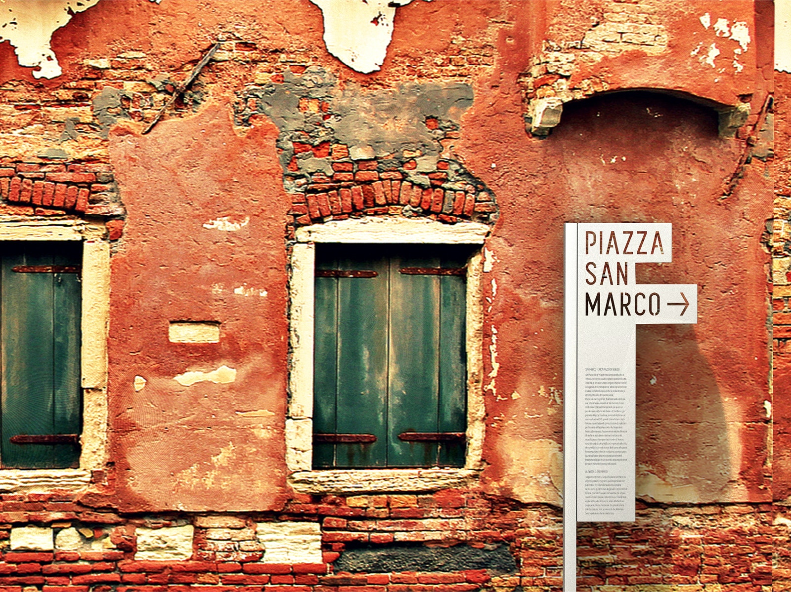
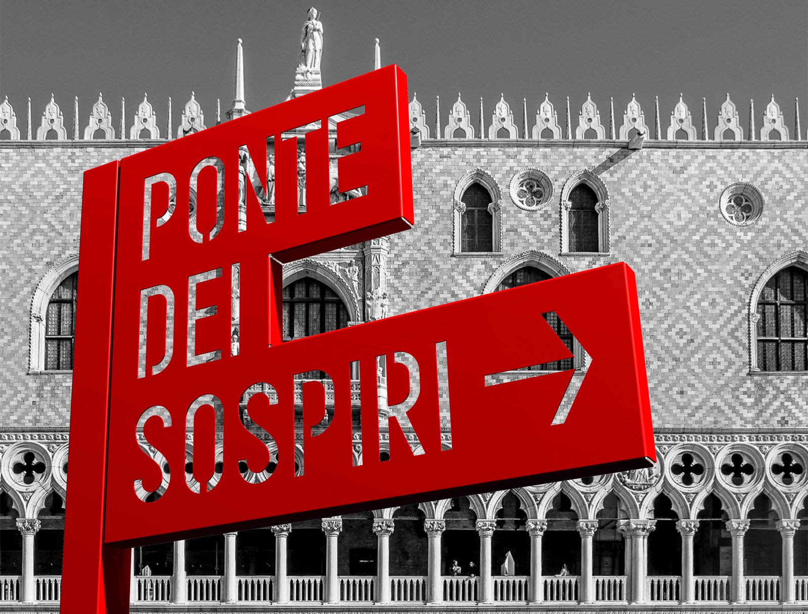
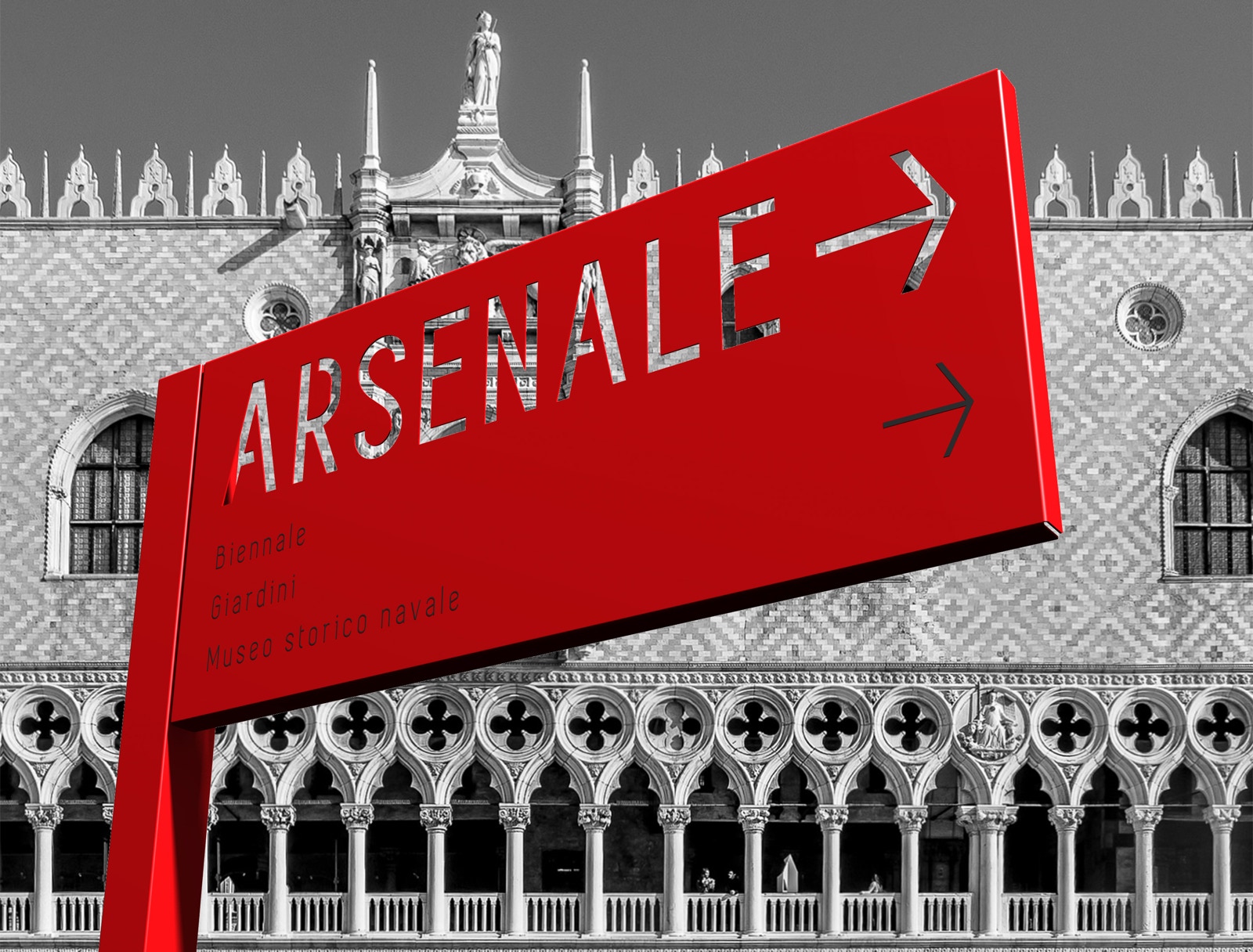
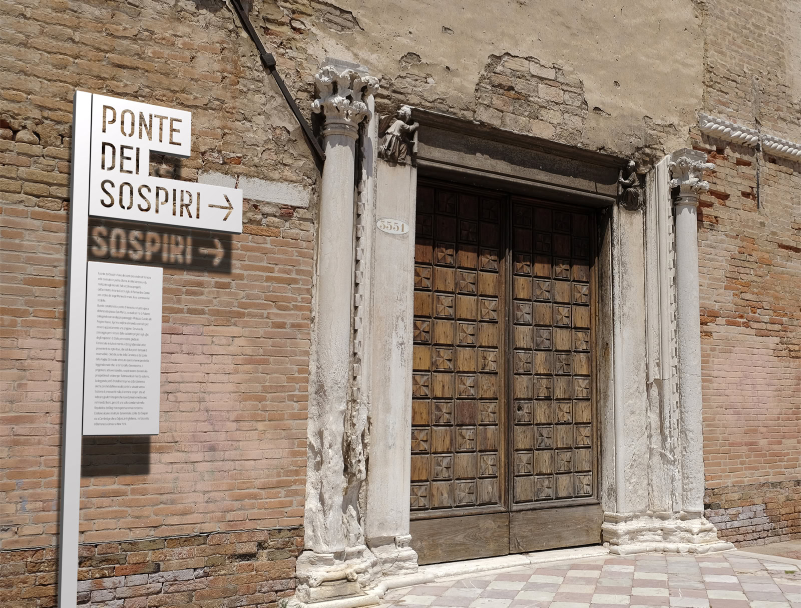
The will is to describe the city in a play of plans and transparencies, trying to reveal it and enhance it. Bellavista wants to be part of a contemporary perception of an existing situation that comes from different ages. This way of dealing with the theme did not prevent a systematization for everything relating to functional and subsidiary information, even the most repetitive as directional indications. Bellavista’s other assumption is continuity: to structure the information system in a single logic that informs all its subsystems. Graphic processing is based on the use of text and font in horizontal compositions on a carved aluminum support, bent and dimensioned according to the progression and flow of text, providing flexibility and variation in its application while simultaneously reducing its size. The support pole is made of wood and the terminal is customizable in shape and color. An identifying graphic and typographical structure based on the repetition of a number of recurring elements that contribute to creating visual cohesion. A composition with overlapping and transparency play, whose goal is to provide a recognizable visual language and able to adapting to the various communication needs. Product characterization is such that the use of a single element gives a unitary perception of the entire coordinated communication system. The proposed font is “Simplifica”, considered a versatile, readable and modern font. With regard to the chromatic aspects, the availability of colors meets the needs of different insertion contexts, so that there is contrast between background and signal and the information can easily be identified. Since the communicator is the institution, the administrative power of the city must prevail over the rest in terms of visibility and recognition, hence the proposal of a coordinated image that refers to easily recognizable colors and which form part of the collective imagination of city. The design of these elements, clearly contemporary, allows neutral and clear information about the façade that will be clearly distinct from the object.
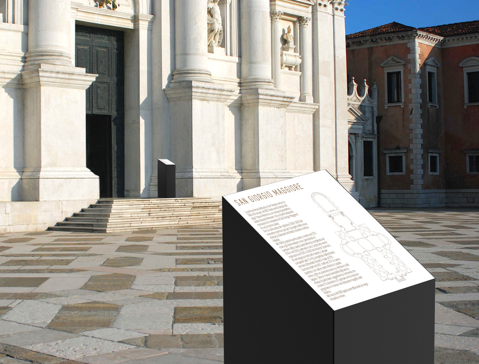
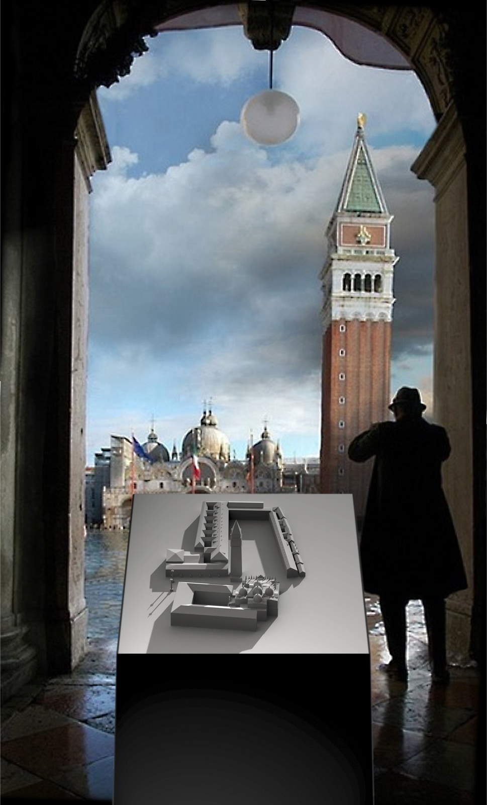
The identification and information system is configured with elements called “Totem” supporting information panels located near historic buildings and in important architectural contexts with the aim of providing adequate information without significantly interfere with the context described. The design of these elements allows the insertion into space in a “silent” way, with respect for the identity of the places and dialogue with it. At the level of communication, aesthetics is a complementary value to that of information transmission: communication has an attraction in the aesthetic, the trace of the presence of a system, which makes it visible and recognizable, participates in its communication. The aesthetic component is assumed as an added value for communication, as it avoids that the element camouflages itself in the multitude of other signs, falling into anonymity. As an alternative to the information panel, a 3d printed model of the described architecture is available.
The three-dimensional representation of architectures through models responds to the will to transmit with great simplicity the knowledge of the physical construction, but also symbolic, of the historical city, through the reproduction of the architectures to which this task has been assigned and which have consequently become with time icons and metaphors of the city itself. The maps are multiplied and translated into thematic maps, tools that emphasize the many vocations of the territory crossed by a grid of paths: wine paths, sacred paths, park paths are just some of the infinite ways to read the territory and to transcribe points and connections on the map that help to define different spatial structures.
The “Totem” is monolithic, dark or black, clean and precise in its geometric lines, a “fragment” where the sectioned surface is highlighted by contrast with a different material and color. The information is arranged on this surface.
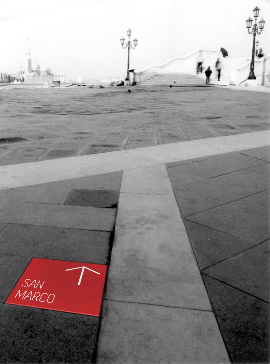
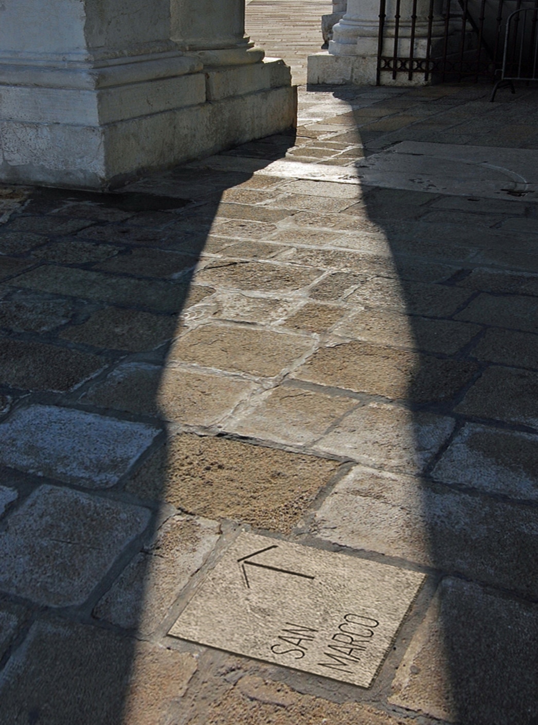
The approach of a pedestrian and a cyclist to the information system is very different from that of a motorist. For this reason, the design of a pedestrian and cyclist oriented system is a detail project, because it can be simpler and more immediate than road signage. Improving orientation, accessibility and use of information for pedestrians and cyclists generates a more inviting experience for everyone. The sign system dedicated exclusively to pedestrians and cyclists allows lower visual impact. From these considerations and from the design tension aimed at the synthesis and simplicity of things, comes “Briciola”, a floor element for signaling and orientation for pedestrian and cyclist, designed for the streets and squares of the city. Square-shaped, made of metal or stone on a concrete block, can be easily inserted into existing pavements with no interference to the overall visuals. Inspired by the famous Grimm brothers' tale, “Briciola” is a hymn to simplicity and joy!
At the CosmoBike Show in Verona Massimiliano Gamba and SI.SE SpA win the CosmoBike Tech Award 2016 with the Bellavista and Panorama systems.
Design
Massimiliano Gamba
2016
Client
SISE SpA


